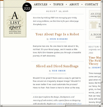
- All text is reduced — 0.8125em applied to
<body>. - It has four (yes, 4) columns with fixed widths and absolute positioning.
- It is duplicated under www.alistapart.com.
The appalling visual design makes the site a joke.

This site apparently gives good advice on various web-design issues, but I'd be rather sceptical given its appearance in my very reasonable rendering environment.
<body>.The appalling visual design makes the site a joke.

Seems like a more adaptive layout! Some graphics have not adapted, but still good!