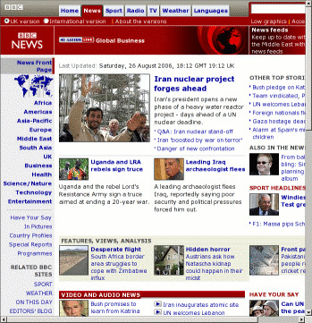
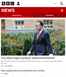
- Font sizes based on
pxabound! <table>s within<table>s within<table>s, and mainly anonymous too, making corrective styling very difficult- Spacer images also abound, some forcing minimum widths on columns and the page as a whole.
- Lynx view: 60 lines of text to get to the distinct content. There's a link to skip to it, but I don't want to have to traverse two links for each page for something that could have been so easily accomplished.
- There's a low-graphics version of each page, which avoids many problems, but cuts out more than necessary; for example, the RSS feed.
The point of the Web has been completely missed.

