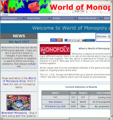
- Surely, the title should be just ‘World of Monopoly’, as indicated by the huge image across the top (and beyond)?
width:956px— Marvellous! Turn the stylesheets off, though, and everything fits except for a couple of irrelevant images.- Font sizes are in pixels.
- That big image across the top has an
altofMain Title
! - Turn stylesheets off, or use a text browser, and be confronted with about 3½ pages of navigation.
Pffft!


