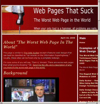
- That's a title? The description is actually shorter! It also has an out-of-context trailing colon.
font-size: 70%is applied to<body>, then it's set to1.1emlater, so that comes to 77% of the user's default.- A fixed width is applied to the
<div>encompassing all content. - Navigation also has a fixed width.
- The border separating navigation and content depends on the fixed width.
- When you turn CSS off, navigation comes first. The main content is a whole screenful further down.
It's a candidate for its own prize.
